SALES PIPELINE
CRM Dashboard: The Complete Guide to KPIs, Examples & Setup

By Ganesh Ravi Shankar
Last updated on Jun 23, 2026
Explore this blog to understand what a CRM dashboard is, which KPIs actually move the needle, how AI-powered dashboards work differently, and how to set one up step by step, with real examples

- What Is a CRM Dashboard?
- Types of CRM Dashboards
- Essential CRM KPIs to Track
- What Does a CRM Dashboard Actually Look Like? (Examples)
- How to Set Up a CRM Dashboard: Step-by-Step
- CRM Dashboard Features to Look For
- Visualizing Data for Better Insights
- Best Practices for CRM Dashboard Setup and Maintenance
- Final thoughts
What Is a CRM Dashboard?
A CRM dashboard is a real-time visual display of your most important customer relationships and sales data pulled from across your CRM software and surfaced in one place. Instead of running reports or exporting spreadsheets, your team sees pipeline health, deal status, team activity, and revenue forecasts at a glance.
Think of it as the control panel for your sales operation. At any given moment, it should tell you: how healthy the pipeline is, which deals need attention, where reps are falling behind, and what's driving or blocking revenue.
A CRM dashboard is not the same as a CRM report. Reports are pulled on demand and show historical data. Dashboards are live, always-on, and built for daily decision-making.
The three things a great CRM dashboard does:
- Replaces gut-feel decisions with real data
- Surface problems before they become losses
- Keeps every role, rep, manager, and executive focused on the metrics that matter to them
According to Gartner, CRM remains one of the fastest-growing enterprise software categories precisely because of this shift toward real-time, data-driven sales management.
CRM Dashboard Template (Ready to Use)
Before diving into the types of CRM dashboards, here is a ready-to-use layout you can apply immediately
Types of CRM Dashboards
Not all CRM dashboards serve the same purpose. The type you build should match the role using it and the decisions it needs to support.
Sales dashboard, the most common type. Tracks pipeline value, deal stage distribution, win rate, deal velocity, and individual rep performance. Built for sales reps and their managers. Updated in real time as deals move.
Sales forecasting dashboard, focused on revenue prediction. Shows forecast vs target, weighted pipeline by close date, and trend lines for revenue over time. Used by sales managers and revenue leaders to call the quarter with confidence. See our sales pipeline guide for how to structure your forecasting metrics.
Marketing dashboard tracks lead volume, source quality, cost per acquisition, campaign ROI, and MQL-to-SQL conversion. Helps marketing teams understand which channels are filling the pipeline with deals that actually close.
Customer service dashboard, monitors open tickets, first response time, resolution rate, NPS, and churn signals. Essential for support teams managing at-risk accounts.
Executive dashboard, high-level view of overall business health. Revenue vs target, pipeline coverage, win rate trend, customer count, and retention rate. No granular activity data, just the numbers that matter at the board level.
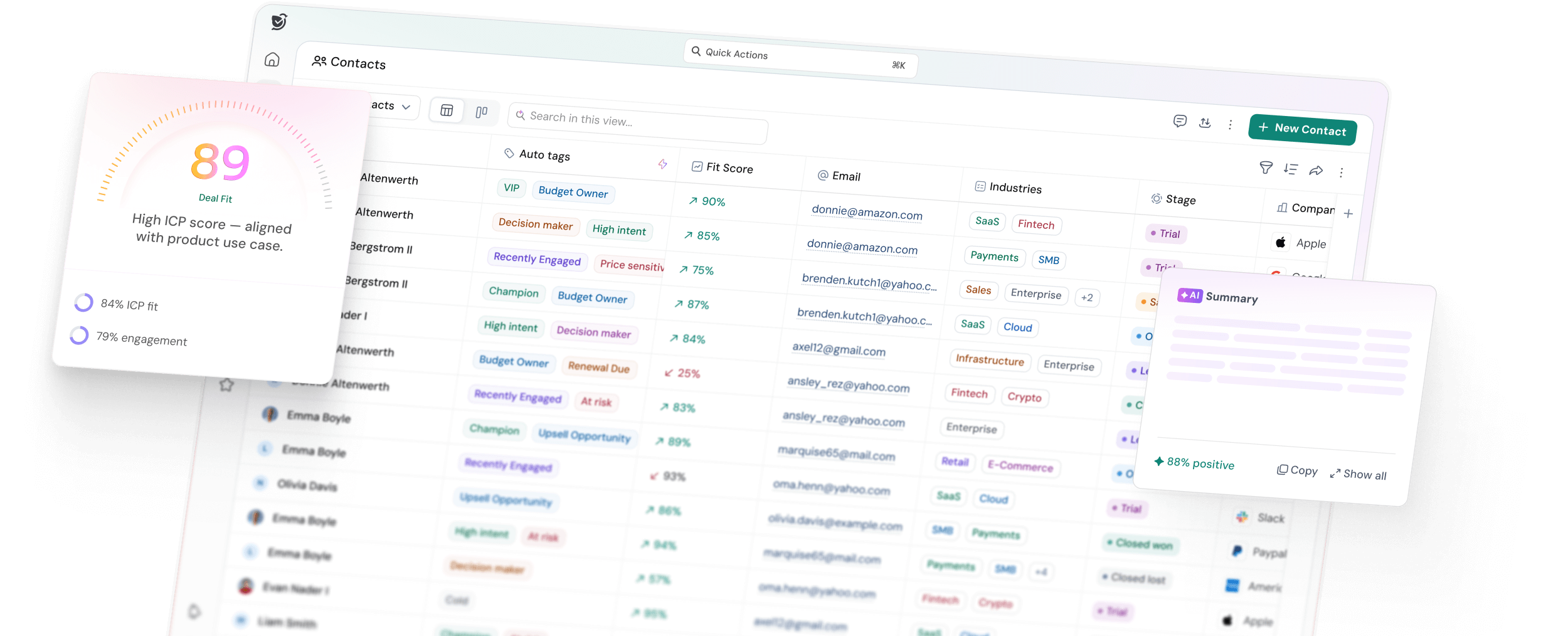
AI-powered CRM dashboard, the newest and most powerful type. Goes beyond standard KPIs to surface AI-generated signals: deal score, ICP fit score, buying intent, engagement score, risk factors, and next best actions. These dashboards don't just show you what happened, they tell you what to do next. Learn more in our AI-powered CRM guide.
SparrowCRM's dashboard falls into this last category. Every contact, company, and deal record surfaces AI scores alongside traditional metrics, so your team spends less time reading data and more time acting on it.

Essential CRM KPIs to Track
The metrics below are split by function. Track the ones relevant to your role, not all of them at once. For a full breakdown of how these connect to your reporting setup, see our guide on CRM reporting and analytics.
Sales KPIs
KPI | What It Measures | Formula | Healthy Benchmark |
Pipeline value | Total value of all open deals | Sum of all deal values by stage | 3–4x your quota |
Win rate | % of deals closed won | Closed won ÷ total closed × 100 | 20–30% for B2B SaaS |
Deal velocity | How fast do deals move to generate revenue | (Opportunities × Avg deal size × Win rate) ÷ Avg sales cycle days | Varies by ACV |
Average sales cycle | Time from first touch to close | Sum of all cycle lengths ÷ total deals | Shorter = healthier |
Pipeline coverage ratio | Pipeline vs quota | Open pipeline value ÷ quota | 3x minimum |
Stage conversion rate | % of deals moving stage to stage | Deals entering next stage ÷ deals entering current stage × 100 | Reveals bottlenecks |
Marketing KPIs
KPI | What It Measures | Formula |
Cost per acquisition (CPA) | Spend to win one customer | Total sales + marketing spend ÷ new customers |
Lead source ROI | Which channels produce revenue | Revenue from source ÷ spend on source × 100 |
MQL to SQL conversion | How many leads are sales-ready | SQLs ÷ MQLs × 100 |
Time to conversion | How long does it take for leads to become customers | Avg days from first touch to closed won |
Customer Service KPIs
KPI | What It Measures | Benchmark |
Net Promoter Score (NPS) | Customer loyalty | 50+ is excellent |
Churn rate | % of customers lost in a period | Lost customers ÷ starting total × 100 |
First response time | Speed of first reply to support tickets | Under 4 hours |
Customer health score | Risk of churn per account | Composite of engagement, usage, and support signals |
AI-Powered KPIs (SparrowCRM)
This is where most CRM dashboards stop, and where SparrowCRM's goes further. Understanding how each of these AI-enriched fields is calculated helps your team trust and act on them.
AI Metric | What It Shows |
Deal score | Overall strength of an opportunity based on activity, engagement, and deal signals. Increases or drops with a reason shown automatically. |
ICP fit score | How closely a contact or company matches your ideal customer profile. 0–100%, labeled High / Medium / Low. Customizable in Settings. |
Engagement score | How actively a contact is interacting with your outreach emails, calls, meetings, and website activity combined on a 0–100 scale. |
Buying intent | Real-time readiness to buy. Based on demo signups, pricing discussions, stakeholder involvement, and positive replies. Shown with key driving signals. |
Response rate | How consistently a contact replies across emails, calls, and meetings channel-by-channel breakdown available on hover. |
Risk factors | AI-flagged blockers: single-threaded risk, low engagement, competitor mention, budget concern, and wrong stakeholder. |
For more on how lead scoring works alongside dashboard metrics, see our lead scoring guide.
What Does a CRM Dashboard Actually Look Like? (Examples)
Here are the most common CRM dashboard layouts used by sales teams, with notes on what each panel shows and why it matters.
Example 1: Sales Rep Daily Dashboard
A rep's dashboard should answer one question every morning: where should I focus today?
- Open deals by stage (kanban or funnel view)
- Tasks due today and overdue
- AI-suggested next actions per deal
- Emails sent vs replied, last 7 days
- Deals at risk (flagged by AI)
- Upcoming meetings for the day
Example 2: Sales Manager Pipeline Dashboard
A manager needs to see the whole team without getting into individual call logs.
- Total pipeline value vs quota, current quarter
- Pipeline by rep (who's healthy, who's behind)
- Win rate trend, last 90 days
- Deal velocity by stage
- Deals that haven't moved in 14+ days
- Forecast: weighted pipeline vs target
Example 3: Revenue Leader Forecasting Dashboard
- Committed, best case, and pipeline forecast, current quarter
- Revenue trend, last 4 quarters
- New vs expansion vs renewal split
- Lost deal analysis, top reasons this month
- Pipeline coverage ratio by team
Example 4: AI-Native CRM Dashboard (SparrowCRM)
Every object in SparrowCRM contacts, companies, deals carries its own AI scoring panel visible at the top of each record. At the dashboard level, this means:
- Deal score changes surfaced automatically (increased/dropped + reason)
- Buying committee analysis who holds the budget, who influences the deal
- Competitor mentions flagged from emails and call transcripts
- Similar won deals AI-suggested based on industry, size, and pain points
- Next actions AI-generated to-do list per deal, auto-refreshed after each interaction
Turn your dashboard into a decision engine for faster revenue
How to Set Up a CRM Dashboard: Step-by-Step
Step 1: Define the purpose before you build
Every dashboard should answer one specific question. "How is the pipeline performing this quarter?" is a good dashboard. "Everything about the business" is not. Start by identifying who will use this dashboard, what decision it needs to support, and how often it will be checked.
Step 2: Choose your metrics, maximum 8–10 per dashboard
More metrics = less clarity. Pick only the KPIs that directly drive action. Use the tables above as a reference. A sales rep dashboard needs fewer metrics than an executive dashboard, but each one should be immediately actionable.
Step 3: Set your data sources and refresh rate
Decide where each metric comes from and how fresh it needs to be. Sales pipeline data should refresh in real time. Marketing spend data may only need daily updates. Most modern CRMs — including SparrowCRM — handle this automatically through native email, calendar, and phone integrations.
Step 4: Build role-specific views
Never give everyone the same dashboard. Build separate views for reps, managers, and executives. In SparrowCRM, you can create custom views per user role using AI Filters for example, filtering contacts by "High Buying Intent not contacted in 10 days" or deals by "Deal Score dropped this week."

Step 5: Add alerts for the metrics that need immediate action
Real-time dashboards are most powerful when paired with alerts. Set triggers for: deals stuck in a stage for more than X days, deal score drops, contacts going cold, or pipeline falling below coverage ratio. SparrowCRM's AI flags these automatically in the Next Actions section of each record.
Step 6: Run a team walkthrough before launch
The biggest reason dashboards fail is adoption not technology. Run a 30-minute walkthrough with each team, showing them exactly what the dashboard means and what they're expected to do with it. Tie each metric to a behaviour: "When your deal score drops, here's what to check."
Step 7: Review and prune every 90 days
Dashboards decay. Metrics that mattered in Q1 may not matter in Q3. Every quarter, audit your dashboards: which panels are being used, which are ignored, and which new metrics should be added. Remove anything that isn't driving a decision.
CRM Dashboard Features to Look For
When evaluating CRM dashboards, these are the capabilities that separate genuinely useful tools from ones that look impressive in a demo but fail in daily use. See our full breakdown of essential CRM features for a wider checklist.
Real-time data sync: your dashboard should reflect what happened five minutes ago, not yesterday. Look for native integrations with your email, calendar, and phone tools so activity data flows in automatically without manual logging.
Role-based views: one-size-fits-all dashboards don't work. Your CRM should let you build separate dashboards for reps, managers, and executives, with field-level permissions controlling what each role can see.
AI-generated insights: the best modern CRM dashboards don't just display data, they interpret it. Look for: deal scoring, lead scoring, buying intent signals, risk flagging, and next action recommendations generated automatically from your activity data.
Customizable chart types: funnel charts for pipeline stages, line graphs for trends, bar charts for rep comparisons, gauge charts for quota attainment, and KPI cards for at-a-glance numbers. You should be able to choose the right visual for each metric.
Mobile access: your sales team is not always at a desk. Dashboard data needs to be readable and usable on mobile during calls, meetings, and demos.
Alerts and triggers: proactive dashboards notify you when something needs attention instead of waiting for you to check. Deal score drops, stalled deals, low pipeline coverage — these should trigger alerts automatically.
Visualizing Data for Better Insights
Visual stories from raw CRM data create instant understanding that spreadsheets can't match. The right visualization changes complex information into practical insights in seconds.
Match the chart type to the data:
- Funnel charts: use for pipeline stage tracking. Shows exactly where prospects drop off and which stages are bottlenecked.
- Line graphs: use for trend data over time. Revenue trends, win rate by month, pipeline growth. Connect data points to reveal patterns and support forecasting.
- Bar graphs: use for comparisons. Rep performance vs target, lead source volume, and deal count by stage. Side-by-side bars make differences immediately visible.
- Gauge/speedometer charts: use for quota attainment and target tracking. Shows at a glance whether you're on track, behind, or ahead.
- KPI cards: use for single numbers that need to be read at a glance. Pipeline value, win rate, and number of active deals. No chart needed, just the number and its trend direction.
Rules for visual clarity:
- Limit to one story per chart. A single bar chart comparing 5 reps' win rates is useful. A bar chart comparing 5 reps across 8 metrics is noise.
- Use color deliberately. Highlight what needs attention red for below target, green for on track. Don't apply color as decoration.
- Label axes and values clearly. Your team shouldn't have to hover to understand what a number means.
Best Practices for CRM Dashboard Setup and Maintenance
Keep it focused: Each dashboard should serve one role and answer one question. If you're trying to build a single dashboard that works for reps, managers, and the CEO, you'll end up with one that works for no one.
Limit to 8–10 metrics per dashboard: Beyond 10 KPIs, dashboards become noise. Start with fewer metrics, validate they drive decisions, and add more only when needed.
Tie every metric to an action: If a metric changes, your team should know what to do. "Pipeline coverage dropped below 3x" → create more pipelines. "Deal score dropped" → check the AI risk flags and call the contact. Metrics without linked actions are decoration.
Set automated refresh schedules: Sales pipeline data should be live. Marketing spend data can be daily. Financial summaries can be weekly. Match refresh frequency to how urgently each metric needs to drive action.
Run quarterly dashboard audits: Check which dashboards are being opened and which are being ignored. Delete unused dashboards. Update metrics that have shifted in business priority. Add new AI signals as your CRM captures more data.
Get team feedback regularly: A simple monthly question "Is this dashboard helping you make better decisions?" will surface problems faster than any analytics tool. Dashboards built without user feedback drift toward complexity and get abandoned.
Final thoughts
CRM dashboards are the control panel of your sales operation. They replace guesswork with real-time visibility showing what's happening in your pipeline right now, which deals need attention, and where your team should focus.
The best dashboards aren't the ones with the most metrics. They're the ones that give the right person the right information at the right time and make the next action obvious.
Start with a focused dashboard for one role. Validate it's driving better decisions. Then expand. Whether you're building your first CRM dashboard or replacing a setup that's become too complex, the principles are the same: clarity, role-specificity, and a direct line from data to action.
Frequently Asked Questions (FAQs)
Related Articles

25 Apr, 2025
Choosing the Right CRM: What You Need to Know Before You Decide

02 Apr, 2026
What Is CRM Software? The Complete Guide for Sales Teams in 2026

09 Apr, 2026