SALES PIPELINE
Sales Pipeline Report: Detecting Pipeline Gaps using CRM Heatmaps
By Beatrice Levinne
Last updated on May 26, 2026

Tired of drowning in pipeline data without knowing where deals are stuck?
Sales pipeline reports can reveal significant gaps that might go unnoticed without proper visualization. Large amounts of data from sales regions and stages make it difficult to spot trends and bottlenecks.
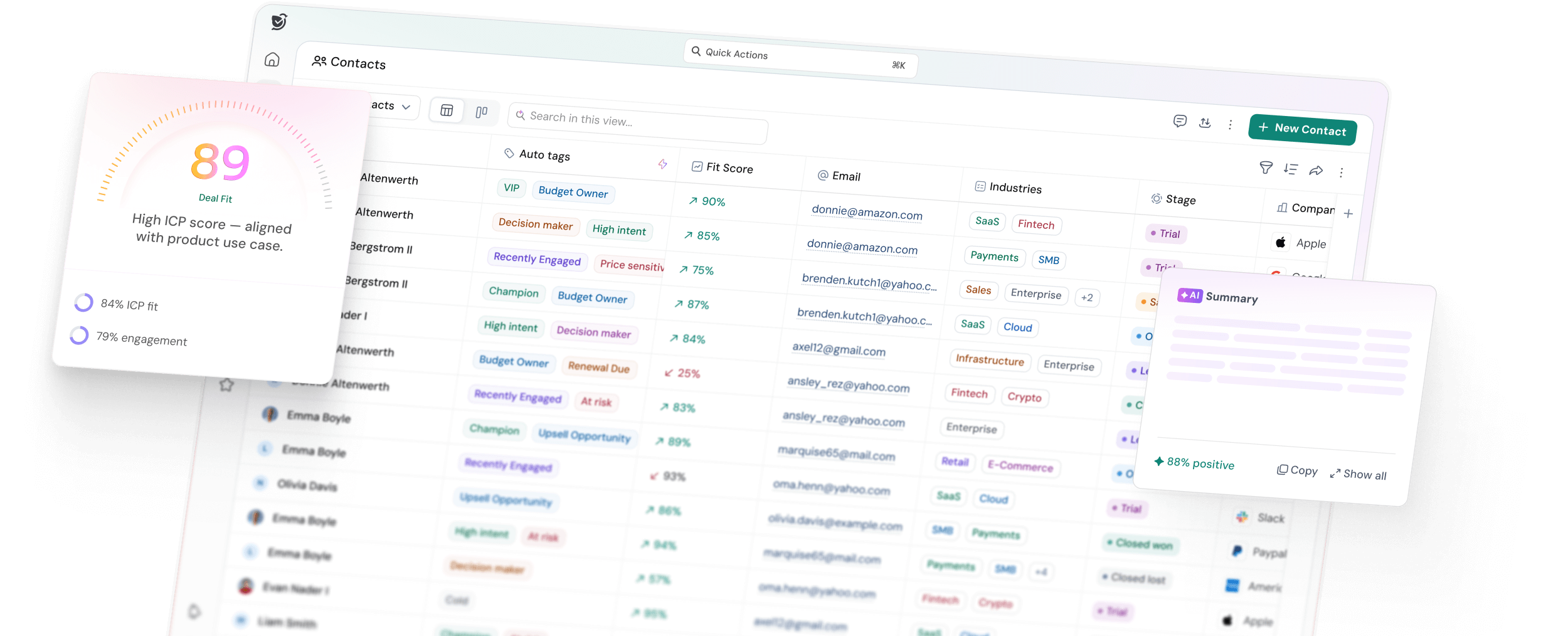
Heatmaps change your CRM data into visual representations that simplify and speed up analysis. The sales heatmap displays activity levels through color gradients - darker colors show higher values in metrics like engagement minutes or contact records. Data filtering happens instantly as you click different areas of your heat map report to identify pipeline health issues.
CRM heatmaps help you spot low-engagement zones, track intent keywords, and find upsell opportunities that might stay hidden otherwise. This piece demonstrates how to build effective sales pipeline reports with heatmaps. You'll learn to interpret data, find gaps, and utilize these insights to improve your sales strategy in regions of all sizes.
Why Heatmaps Are Useful for Sales Pipeline Reports
Heatmaps turn complex sales data into visual insights you can act on right away. Color-coded grids show your sales pipeline visually and point out exactly where you need to focus.
Visualizing sales activity trends
A quick look at heatmaps gives you a complete view of your sales pipeline. You'll see patterns emerge through color intensity instead of digging through spreadsheets. The visual layout helps you spot trends hidden in your data and analyze how well different areas perform.
These heatmaps tell clear visual stories about time-based patterns. You can see how your sales activities perform through the week or month to find peak performance times. A sales team found that their highest engagement rates happened on Wednesdays and Thursdays, so they scheduled most calls during these prime times.
Quickly spotting pipeline bottlenecks
Sales heatmaps make bottlenecks jump out at you. The colors show which deals are stuck or moving too slowly. You can spot trouble areas at a glance without searching through endless reports.
Heatmaps point out:
- High-value deals that need your attention now
- Underperforming parts of your pipeline
- Places where deals get stuck between stages
This visual approach helps you zero in on critical areas faster than regular reports. The easy-to-read color gradients make analysis much simpler than reviewing endless analytical data.
Comparing performance across regions
Heatmaps really shine when you compare sales performance in different territories. You can see which regions bring in the most revenue or have the highest customer density.
These maps show how customer questions match up with your current sales coverage and reveal whether your resources fit market opportunities. You might find untapped markets or areas that need strategic attention because they're not performing well.
Your team can use these geographic insights to make smarter decisions about territory assignments. This ensures fair workloads while maximizing each region's potential. The bird's eye view helps you decide where sales coverage works well and where changes could boost your results.
How to Build a Sales Heatmap in Your CRM
The sort of thing I love about sales heatmaps is how they can transform your CRM data into actionable insights. Let me show you five steps that will help you create a powerful visualization of your sales pipeline.
Select the right CRM view or report
Your first task is picking the right data source in your CRM. The heatmap option in your CRM dashboard lets you select the entity (like Accounts, Opportunities, or Leads) and the specific view you need. These choices determine which records show up in your visualization. Dynamics 365 users will find this under "Select Datasource" where they can pick both the entity and its view.
Define your key metrics (e.g. revenue, deal count)
Your next step involves choosing how to measure and display your data. The "Select Measure" option helps you define how regions should be color-coded. Most CRMs count records by default, but you can pick any numeric or currency field such as Annual Revenue, Opportunity Value, or Profit. Your chosen measurement determines the color intensity on your heatmap.
Apply filters for stage, rep, or region
Your heatmap becomes more useful when you add relevant filters. The "Select Category" option helps you focus on specific data points. You can filter results by sales rep, business type, account name, or any other field that makes sense for your analysis. These filters help you zero in on specific parts of your sales pipeline.
Choose display type: boundary, pie, or column
Pick the visual style that works best for your needs:
- Boundary display: Shows data within geographical boundaries like states or countries
- No Boundary: Creates heatmaps based on data density alone
- Pie chart: Displays comparative data as pie charts on your map
- Column chart: Shows proportional data as column heights
Save and share your heatmap report
Your final step is preserving your work. Give your report a descriptive name and click "Save". You can export your heatmap as an image file (PNG/SVG) or raw data (CSV). These visual insights help your team develop better sales strategies together.
Interpreting CRM Pipeline Heatmap Data to Detect Gaps
Your meaningful analysis starts after building the sales heatmap. The colors and patterns reveal critical gaps that regular reports might overlook in your pipeline.
1. Low activity zones and what they mean
Cold zones on your heatmap (typically blue areas) show minimal customer interaction. These areas represent regions or segments where your pipeline needs attention. Your territories might be underserved or marketing efforts might prove ineffective in blue zones. A scroll heatmap reveals your customers' movement through sales pages, and sharp color changes highlight where prospects leave - often because they mistakenly think they've reached the content's end.
Market segments that need strategic attention or additional resources become visible in areas with consistent blue shading. These cold zones help retail or territory-based sales teams spot underperforming regions that demand quick action.
2. Stage drop-offs and conversion issues
Pipeline heatmaps show where deals get stuck between stages. Major color changes between pipeline phases point to conversion problems. Companies of all sizes see an average MQL to SQL conversion rate of 16%, which makes this transition crucial to watch. Your heatmap analysis should focus on:
- Deals that exceed your average sales cycle length
- Stages without movement for over 2 weeks
- Sharp color intensity differences between consecutive stages
These signs point to process problems rather than just performance issues. To name just one example, see how a healthy number of opportunities entering a stage followed by minimal movement suggests qualification issues at that point.
3. Rep-level performance gaps
Your team's pipeline challenges become clear through heatmaps. The core team's color variations reveal differences in activity levels, win rates, and pipeline velocity. CRM heatmaps highlight which members excel at specific stages while facing challenges in others.
4. Intent vs. engagement mismatches
Modern sales teams must balance buyer research topics with content interaction. Intent signals drive campaigns, but real engagement proves actual investment in your solution. Prospects might show high intent but low engagement in your pipeline heatmap - this shows potential misalignment.
Your biggest chance for targeted follow-up lies with accounts that research competitor content or show interest in specific keywords but fail to engage with related materials. This pattern deserves special attention.
Using CRM Heatmaps to Improve Sales Strategy
The colorful insights from your CRM heatmap data can now transform into strategic action. Visual pipeline analysis helps you make smarter decisions about your sales efforts.
1. Reallocating resources to high-potential areas
Heat maps spotlight territories with untapped potential clearly. A second sales rep could boost coverage and increase revenue when one region shows a surge in closed deals. Your decision-making becomes more accurate with this visual approach.
Look for areas that demonstrate:
- High customer density based on annual revenue
- Underserved markets with growth potential
- Geographical hot spots for specific products
You can move resources from consistently low-performing areas to zones with higher conversion potential once you spot these opportunities visually.
2. Setting realistic targets by region
Your sales heatmap gives vital data to set territory-specific goals. The heat mapping reveals which retail displays need adjustments to reduce bottlenecks or boost foot traffic near promotional products.
Boundary heat maps help segment your CRM data by region. Teams can analyze performance patterns to set achievable targets based on past results. Sales teams can focus on promising areas while setting realistic expectations for challenging territories with this targeted approach.
3. Improving follow-up in cold zones
The blue areas or cold zones on your heat map need strategic attention. The first step is to find why these areas don't perform well - whether it's lack of interest, poor follow-up, or market saturation.
Areas with low engagement need focused marketing campaigns that address their specific challenges. Marketing teams can create targeted campaigns for regions where lead generation lags after they see the lead distribution through color-coded scales.
4. Aligning marketing with sales heatmap insights
Shared heatmap visualizations make sales and marketing work together smoothly. Both teams can analyze lead datasets and make unified decisions during targeting through these visual elements.
Heat maps show customer touchpoints throughout the sales lifecycle. This helps you learn about user behavior, priorities, and pain points. Marketing can create region-specific campaigns that tackle real challenges your sales team faces in different territories with this shared understanding.
Your decisions about resource allocation, target setting, and team alignment will improve when you add heatmap insights to your sales strategy.
Use Cases of CRM Pipeline Heatmaps
CRM pipeline heatmaps are a great way to get practical applications that go way beyond the reach and influence of simple analysis. These tools help sales teams learn about detailed aspects of their business.
Spotting low engagement regions
Color-coded visualizations quickly show areas where customer interaction is minimal. Sales teams can see these "cold zones" and identify territories that need more attention. The color gradient makes it easy to spot where business activity needs focus. This allows teams to target specific regions that need improvement. Sales managers look at these visualizations to understand how different areas perform and take steps to boost overall sales.
Identifying high-performing sales reps
Heat maps let you match sales representatives' performance based on their territory results. You can see which team members do well in specific regions or with certain products. A real-world example shows two sales reps with matching revenue numbers. The heat map showed one rep worked with nowhere near as many customers as the other. This suggested different work patterns and success rates across product lines. Teams can use this information to distribute work fairly and learn what makes top performers successful.
Tracking sales revenue by location
Looking at sales performance within geographical boundaries gives you significant insights at state, county, or ZIP code levels. Heat maps show color-coded data that highlights activity intensity in each area. This makes it easy to spot which states bring in the most revenue or have the largest client base. ZIP code views work especially well with demographic data like income and population. Marketing teams can create targeted campaigns with this information.
Using heatmaps for travel planning
Sales teams can plan better routes with heat map data. They can find nearby accounts, opportunities and leads after booking main meetings. Route optimization lets them see more clients each day while cutting down travel time. Mobile users can quickly find other accounts nearby when meetings get canceled last minute.
Improving lead distribution
Heat maps show how leads spread across territories, which helps create better distribution strategies. Marketing teams can tailor promotion campaigns to industries that have fewer customers. Teams can work smarter by grouping leads as cold, hot, or warm. This helps them set follow-up priorities and assign resources better. Sales teams save valuable time and ensure high-potential leads get the right attention.
Conclusion
Sales pipeline heatmaps revolutionize the way you understand and act on your CRM data. This piece has shown how color-coded visualizations make complex sales information clear and practical.
Heatmaps give you a competitive edge when tracking sales performance. Teams can spot issues instantly instead of digging through spreadsheets or reports. Our partner teams cut their pipeline analysis time by 75% by switching to heat map visualization.
Your team will quickly spot bottlenecks that stayed hidden before with heatmaps. These visual tools prove particularly valuable when comparing performance between regions or sales reps.
CRM heatmaps don't need complex technical expertise to get started. The five-step process makes it simple: select your view, define metrics, apply filters, choose your display type, and share with your team.
Heatmaps work brilliantly for sales teams of all sizes. A small retail client found an underserved territory that became their highest-performing region - all because a cold zone on their heatmap caught their attention.
These visualization techniques are more than just reporting tools - they're decision-making accelerators. Your team's shared view of color-coded data helps sales and marketing arrange naturally, which leads to better resource allocation and realistic targets.
Pick one heatmap view that focuses on your urgent pipeline concern. Soon you'll wonder how you managed your sales pipeline without these visual tools.
Beatrice Levinne
Beatrice Levinne is a former sales professional writing under her pen name for SparrowCRM where she shares CRM-specific content and relatable stories from her sales journey.